47% of your visitors expect your site to load within two seconds, and 40% of them will leave if it takes more than three seconds. Each second of delay decreases customer satisfaction by around 16%, and reduces your sales by 7%.
To put it bluntly, performance can make or break a website.
There are two foolproof ways to increase the speed of your site, and thereby improve customer satisfaction, retention, and conversion:
Decrease the size of your site – a larger site takes longer to download
Use faster hosting – a faster, more responsive server decreases the total time between a visitor pressing enter (or clicking a link) and the page loading
The focus of this article is learning how to decrease your site’s total file size plus learning how to increase its scrolling performance. There are many potential techniques we could cover when it comes to web performance, but we're going to focus on the ones with the largest impact for designers. Luckily, these improvements can all be made in under 30 minutes.
Regardless of your existing technical expertise, reading this simple guide will help you increase your site’s loading speed and visitor retention by a meaningful amount. Let’s get started.
Reducing the size of your site
The single most important technique to speeding up a web page is to make it smaller. I’m not talking about having less content, but rather about reducing the number of kilobytes that your site’s content consumes.
To view a web page, your computer has to download all of the related files from the server to display them in the browser. The more kilobytes a user needs to download, the longer it takes to load the site.
How do you reduce the size of your site’s files? By optimizing images, minimizing text files, and by using smaller images when your site is viewed on smaller screen sizes. It’s time to put your site on a cleansing diet.
Images
Images are the vast majority of your site’s file size consumption, and optimizing images to reduce their size can make your site load several times faster. This is where you should focus the majority of your performance optimization efforts.
I know you want to keep your photos at maximum quality and at 5000px wide, because that’s how you see the individual pores on Obama’s face—but that file is over 10MB and is causing your site to slow to a crawl. Even for a full-page background image, you could get the image down to one or two percent of that type of file size, and it would still look great. For example, the banner image for this post (at the top) is only 15Kb.
Tip: The banner image consumes so few kilobytes because it’s visually simplistic. Visual complexity increases image file size. Therefore, consider using illustrations and graphics rather than detailed photographs. To learn how to find and manage beautiful design resources, check out our previous article.
So how can I reduce the size of my images?
Step one is to open your images in Photoshop then hit File > Save for Web. This opens a special panel with everything needed to optimize your images for reduced file sizes. (See an example photo in the JPEGsection below.)
Start by matching up the image’s resolution to the size that it will display on the site. If you display the image at only 600px wide, then why keep it at 1600px? Chop it down and reap the size benefits—an image with half the width will be even less than half the size. You can double the size (from 600px to 1200px) to make your images look sharp on high-definition displays (Retina, 4K, etc.), but there’s no need to go any higher. Repeat after me: The larger the resolution, the larger the file size!
Aside from reducing the image’s resolution, how else can we reduce its file size? The primary way is to change the image to the best file format for the job then reduce the image’s quality without significantly sacrificing image clarity. It’s fairly easy to do with just a few mouse clicks.
JPEG, GIF, PNG, and SVG are the four main image file formats used on the web, and each have their specific use cases. Let’s go through them and learn how to optimize them.
JPEG
JPEG is the main file type that digital cameras use. It’s a “lossy” image format, which means that simplifications are made to the image data in order to drastically reduce the image’s file size. In the process, image quality decreases (although by how much is up to your settings). To balance between size and clarity, you have the ability to set the image’s quality on a scale from 1-100.
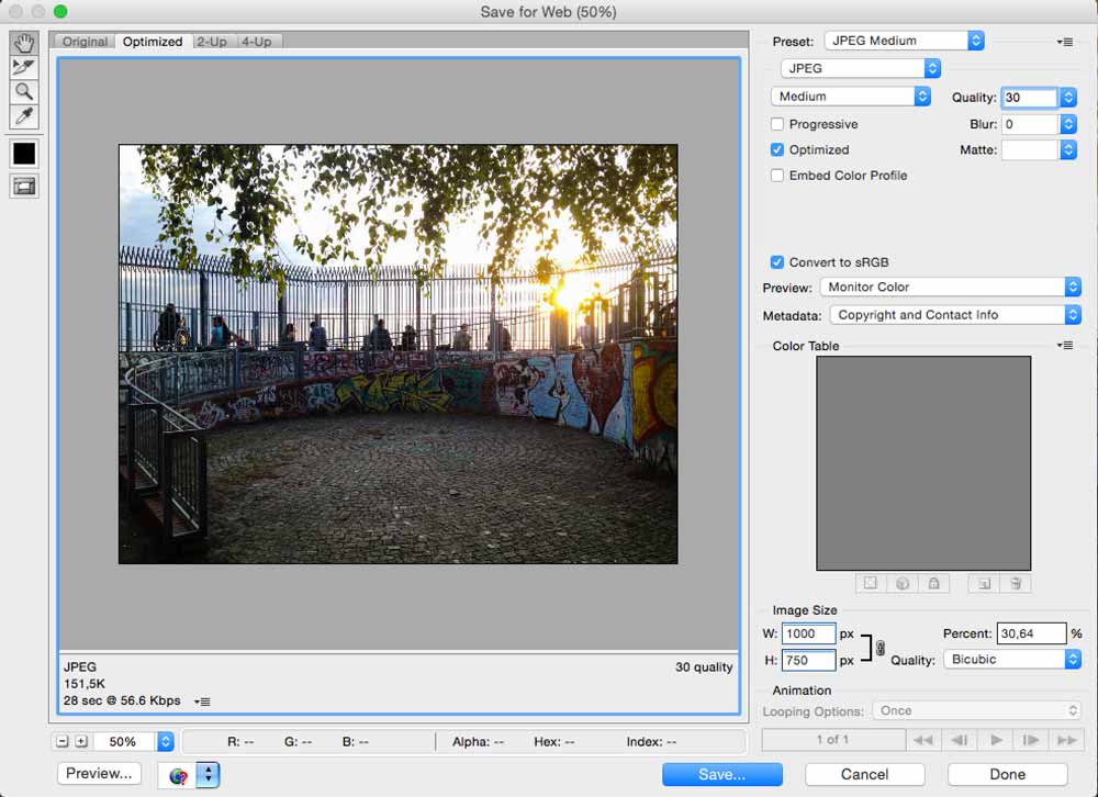
Due to their cleverly-implemented lossiness, JPEGs have significant file size advantages over the other formats, which is why you should use JPEGs for 90% of your site’s images. PNGs and GIFs are smaller only when you severely limit color count (more on this shortly).
Remember, however, that you still want beautiful, acceptable resolution images—so don’t go too wild with your quality slashing. I generally find that a JPEG quality percentage between 30 and 60 nicely balances image clarity and file size. Play around and see what works best for your own images.
Ninja trick: You can get sharper images at lower file sizes by using a larger resolution with an even lower JPEG image quality. For example:


The image on top is 500px wide with a quality of 60% and is 53KB. The image below that is 1000px wide with a quality of 30% and is also 53KB, and it's notably sharper when displayed at 1000px!
JPEGs, unfortunately, do not allow for transparency. What does this mean? Say, for example, you want an image’s background to be transparent so that the color of the area behind it shines through. This wouldn’t be possible with a JPEG. Instead, the blank space behind the logo would default to white. To have a transparent background, you must use a PNG or a GIF. This is why company logos are often saved in the PNG and GIF file formats.
Below are two images against a grey background:


The top image is a PNG with a transparent background, so the grey background visible around the logo. The image on the right is a JPEG without transparency. Notice that its background defaults to white.
GIF
GIF is also a lossless format (no image information is lost in its creation) and it is ubiquitous across forums and throughout Internet memes. GIFs allow for transparency, but their greatest advantage is that they allowanimations (of short durations). GIFs are most commonly used as “mini-videos” for comedic or illustrative purposes:

I feel kind of weird using the term “mini-videos," but I don't know how else to best describe it.
GIFs often look grainy and oddly colored because designers generally limit the number of total GIF colors to between 2 and 256. Reducing the color count can lead to huge file size savings. So, when creating GIFs, if the clarity of the image doesn’t matter too much, decrease the color count as much as possible to reduce its file size!
PNG
PNG is a lossless format, and it boasts the highest image quality of all the web image formats (it’s the best to use if Obama’s pores are that important to you). As mentioned earlier, PNGs support transparencies — and that is the primary reason to use them on your site.
PNGs come in two sub-formats: PNG-24 and PNG-8. PNG-24 is the highest quality version, while PNG-8s allow for smaller sizes by reducing the image’s color count, just as with GIFs. Therefore, if an image only has a few colors to begin with (e.g. a simple company logo as opposed to a detailed photo of a flower), use PNG-8.
Instead of spending the time tweaking the color count by eye, you can use simple drag-and-drop tools likeTinyPNG. TinyPNG automatically converts your PNG into a PNG-8 and removes any colors the image doesn’t actually use. This process can reduce the size of your PNGs by up to 80% without sacrificing transparency or image quality. Your visitors will still see the same beautiful images, but they’ll download much faster.
SVG
SVG is in a completely different category from the other three formats, as they are actually vector graphics—the file type designers often work with in Adobe Illustrator or Sketch. How does that make them different than the others? Well, you can expand an SVG to several times its original size, and it will be just as sharp as it originally was. They’re also incredibly small in file size, render perfectly on high-resolution (e.g. Retina or 4K) displays, and you can even customize them using CSS! Learn more about how to use them here.
How is all this possible? Unlike other images that are made up of specifically-defined pixels, vector graphics (SVGs) are made up of a set of shapes created in XML (an HTML-like markup language). Scaling a typical image reveals the underlying pixels in their full ugly glory, but scaling an SVG preserves the base shapes perfectly.

.png)
.png)
Examples of what you can make with SVGs
But they aren’t the perfect solution for every image. SVGs are generally visually simplistic with just a few colors, suiting such use cases as a company logo, a UI icon, or a simplistic illustration. Hence, you can’t use SVG for photos, but you can make pretty cool animated interface elements with them because they can beprogrammatically controlled via CSS and JavaScript!
Note: You can check out Creative Market to peruse high-quality vector graphics.
To create an SVG, you need to use a vector graphics design program like Adobe Illustrator or Sketch. To reduce the file size of an SVG image above and beyond what Illustrator can do by itself, use a clever tool like SVG-Optimizer.
Using different image sizes for different devices
Do you think that a 3” phone needs to have an image as large as a 32” monitor to look sharp? Nope! Definitely not. You could probably significantly decrease the resolution of the image being served to the phone yet still have it look razor sharp, and the file size savings will be massive.
Mobile devices often rely on relatively slow 3G/4G connections, so your file size saving efforts become even more crucial for the roughly 50% of people visiting your site on mobile devices. And don’t forget, these visitors are probably also working with limited data plans—don’t eat through their 500Mb limit with a 10Mb photo of a dog wearing a suit!
Using CSS media queries, you can actually deliver a different background image for the various device screen sizes that your site is accessed with. This means that you must save your images in a few different sizes. This process only takes a few extra seconds per photo.
With Webflow in particular, it’s very simple to preview a different device view in real time then change the background image to a smaller version (to one that’s lower resolution and hence lower file size). Image changes intelligently propagate down to smaller devices in Webflow, so a background image that’s been set for a tablet-sized device will also automatically be set for phones as well.
Responsive design in Webflow.
Image wrap-up
Here are the key points for optimizing images on your site:
- If you want transparency in an image, use a PNG
- For images with animations, use a GIF
- For simple icons, logos, and illustrations, use SVGs
- If the image has very few colors, use a PNG-8 or a GIF with a reduced color count
- When appropriate, choose simple illustrations over highly detailed photographs
- For colorful images, use a JPEG at a lower image quality (30-60)
- Resize the image closer to the size it will be displayed on your site. Don’t use a 5000px image if it will render at 50px
- Display smaller background images on smaller devices. This is part of the concept of responsive design.
Third-party services: Instead of doing image optimization work yourself, you can use image-resizing services built on top of CDNs, such as imgix. A service like imgix does on-the-fly image resizing and compression then serves the optimized images over a CDN. It also works great when dropping photos into Photoshop isn't an option, such as when you have a library of user-uploaded content.
Minify CSS and JavaScript
Images aren’t the only type of design asset that can be put on a diet—you can also significantly reduce the size of your site’s text files through minifying.
Minifying is the process of reducing the number of characters in a file (this applies to CSS and JS files only). Internally, minifying engines work by removing whitespace (spaces and line breaks), and by replacing longer words with shorter words. It does this in a way that doesn’t change the final behavior of your code. It’s pretty neat. Minifiers often lead to over 60% file size reductions.
You can use simple copy-paste tools like CSSminifier and JSminifier to minify your CSS and JavaScript. If you’re using Webflow, it automatically minifies all your files whenever you publish the site live, so there’s no need to worry about it.
Faster hosting
Beyond making a site smaller, there are two other ways to increase a site’s load speed:
- Visit the site with a faster Internet connection
- Host the site with a faster hosting provider
Since you’re not about to go upgrade all of your site visitors’ Internet connections, you’re left with finding afaster hosting provider.
To save you from a technical discourse, here's the summary: You want fast servers that are strategically distributed across the areas where your visitors live. Why? Because the closer the server is to your visitors, the faster your site will load. Therefore, if your customers are worldwide, so should your servers be.
One of the best hosting providers for these purposes is Amazon AWS, which offers high performance servers distributed across 11 regions around the world. (Webflow’s own one-click hosting is built on top of Amazon AWS’s CDN servers. Check out this performance test for Overton Graphics, a site designed and hosted with Webflow by designer, Josh Overton; it scores 96/100.) A fantastic competitor of AWS isDigitalOcean (although they have fewer regions). Both Amazon and DigitalOcean are much faster and better distributed than smaller boutique web hosts, but much more technical expertise is required to setup websites on them.
Bonus: On-site optimizations
There’s one final piece of the performance puzzle that has less to do with page download speed, and more to do with on-site page performance—and it's just as important. It doesn't matter if your site loads instantly if it jitters and chugs whenever someone tries to use it. In fact, that’s even worse. Load speed is only annoying at first, but a laggy page is annoying throughout the entire browsing experience.
How can you keep your page snappy even after it’s been loaded? It’s all about limiting the amount of processing work the computer needs to do. Primarily, this means limiting animations and UI flourishes:
Don’t go heavy on animations. Animations require a lot of processing and graphics power, and can cause serious lag.
Avoid animating images as much as possible. You can sprinkle them in there, but don't go overboard. Animations require a lot of power, and animating images requires exponentially more power! Browsers have a hard time doing this type of work in bulk—especially on mobile devices.
Be careful about adding too many background gradients, box shadows, and text shadows. These are forms of “pseudo-images” that are equally as intensive for the browser to animate.
And, let's not forget: One of the biggest on-site performance culprits is triggering animations during page scrolling, such as moving page elements around or fading them in and out. Not only does the browser have to process the visual changes associated with scrolling a dynamic page, but it also has to process all your animations at the same time. That's a lot of work. Be mindful of what you're asking the browser to move around.
Don't get me wrong — I’m not saying to not use animations, but to be wary about incorporating too many of them.
Now go forth, and may speed be with you
I’ve now equipped you with the best methods for quickly improving the speed of your websites, but it’s all for naught unless you go forth and put them in action... so get to it!
Before you go, I want to recommend that you use Pingdom’s Website Speed Test to determine your site’sperformance score, which is helpfully accompanied by tips for further improving your site.


