- 21% of millennials no longer use a desktop computer to go online
- Time spent on smartphones increased 394% from the end of 2010 to the end of 2014
- Time spent on tablets increased 1,721% percent in the same period
- Over 75% of Americans use the internet on multiple devices
And according to a 2015 report by the Pew Research Center:
- 15% of Americans have limited ways to access the web beyond their smartphone
- 10% don't have any form of high-speed internet at home beyond their phone
People don’t just browse the web on mobile when they need to — they do it whenever, and wherever, it’s convenient. And sometimes, they do it because they have to. Especially in developing nations where a web-capable phone proves much easier to get than a computer.
Which means we can’t infer context or intent from device anymore — if we ever could. So we designers need to create websites that meet people’s needs regardless of their device.
With consistent design and content strategies across all platforms, you can give people a seamless experience.
Now, that’s not to say it’s easy. But these tips should help.
Responsive vs. adaptive design

Your first choice when starting a design in this mobile world of ours is: whether to use responsive or adaptive design.
What’s the difference? Well, there’s a lot in a name.
Responsive design
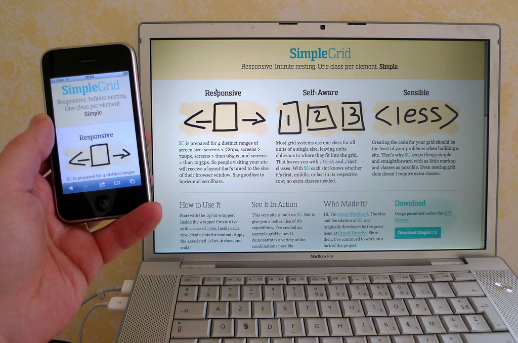
Responsive web design (or RWD) uses relative measurements like percentages and ems (or rems) to ensure that your website responds to the device it’s being viewed on. In other words, your website remains the same, it’s just had content reflowed, reorganized, and resized for a better mobile experience.
Responsive makes a good workflow choice because you essentially design one layout for your site, then adjust for different screen sizes. It’s also good for the end user in that they see essentially the same site no matter what device they’re using. So all the content and functionality they’ve come to expect from the desktop site remains available on their mobile device.
Responsive sites also make maintenance and updates easier since you only have to make content and layout changes once, rather than six or more times. Plus, responsive is more future friendly, because you won’t have to create a new design if a new screen width becomes popular.
That said, if you’re not careful with things like image optimization and media queries, you can end up offering a laggy experience to smartphone users.
Of course, if you’re using Webflow, we manage the queries for you. Not to mention, make tweaking layouts for different screen sizes much easier.
Advantages of responsive design
- A consistent experience across devices
- Easier maintenance
- Future friendliness
Disadvantage of responsive design
- Can be slower than adaptive sites
Adaptive design
Instead of responding to different devices, adaptive web design (AWD) serves unique designs for different common screen widths. So each design is like an adaptation of your core experience (whatever that is).
Instead of responding fluidly to the device someone is using to view your site, AWD uses “breakpoints” to decide which design the user will see. This can offer more flexibility, allowing you to customize your site for different contexts. But there’s always the danger you’ll make the wrong assumptions about what users want. (Analytics prove invaluable here.)
Breakpoint (n.) - a screen width you decide to serve a different design at.
Advantages of adaptive design
- Faster performance
- Customizability for different devices
Disadvantage of adaptive design
- Too many devices to account for
- No future proofing (against the next big thing in devices)
Always be testing
No matter which route you go, never assume you’re providing the best experience for the device. Check out your designs on a wide array of devices to make sure it looks and performs as it should. And, equally important, that it’s fulfilling the goals you defined for it.
Content considerations for mobile users

Because people use the mobile web so much — and so often, to get stuff done — you need to shape your content with mobile in mind.
Here are a few things to keep in mind when designing and creating content with a mobile-first mindset:
Keep navigation simple
There’s no room for mega-menus on mobile, and dropdowns need thoughtful implementation to work. So these time-honored solutions for packing the most content into the tiniest space may warrant a quick, curt goodbye.
The solution: keep it simple.
Highlight the most vital aspects of your site in your main navigation, and offer people paths to other pages through your homepage content.
If you’re designing for a software-as-a-service (SaaS) company, your main nav might contain: Features, Products, Pricing/Plans, and a content-focused page like Blog, or Learn. Other pages, like About or Mission or Jobs can be linked from the main content area, or relegated to a link list in your footer. Building a restaurant site? Then make sure you highlight your Menu and Location/Hours info. And please, please don’t serve up your Menu as a PDF.
If you’re building a massive estore, you’ll want to focus your main nav on the most abstract categories—say, Men’s, Women’s, and Children’s—and let people dig deeper on sub pages. Plus, make search a prominent option so people with some idea what they’re looking for can cut to the chase.
Pro tip: Take a cue from Google and ensure that your search technology enables prediction. No matter how many things people are getting used to doing on their phones, typing still sucks.
By keeping your navigation simple, you’ll not only create a better mobile experience, but also simplify your site for every user. And that’ll help keep you focused on your core message and the behaviors you’re really looking for from people.
Oh—and don’t forget to make your buttons a finger-friendly size, and provide adequate whitespace around text links.
Check out the Nielsen-Norman Group’s article “Supporting Mobile Navigation” for more on this.
Keep your content consistent
There’s little more aggravating than starting an article on your laptop then switching to your phone … only to discover the content’s not accessible there.
And seriously—don’t worry about this whole “people don’t read on mobile” meme. If no one’s reading your content on mobile, you should probably blame your content before you blame your audience or the device they’re using.
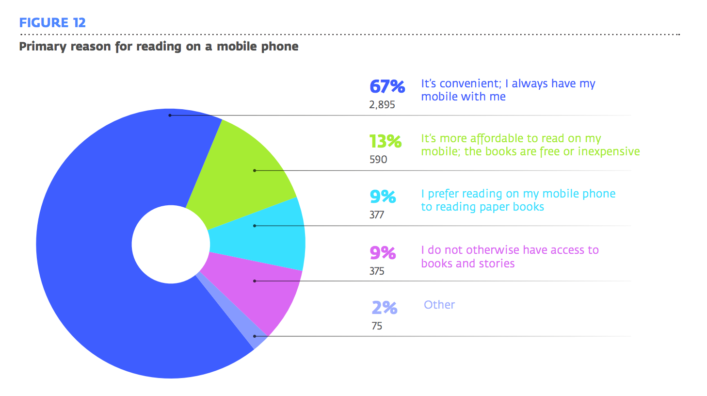
Don’t believe me? BuzzFeed has found that readers actually spend more time reading long-form stories on their mobile devices than on desktops. And a UNESCO study of mobile reading in developing countries found that “whether in North America or rural Ethiopia, people appear to like mobile reading because their device is ‘always there’”—i.e., it’s convenient.

Now, on a marketing page, you obviously don’t want to go on forever about any one feature or product. That just risks losing a potential customer. Instead, quickly and clearly explain what each product or feature enables, then offer a link to learn more. Those who are interested will tap—and others will keep scrolling.
And before you object that all these studies are about reading books and other long-form content: point taken. But the more comfortable we grow with reading long text on our phones, the more comfortable we’ll become with all sorts of reading on our phones. And what’s a marketing page but multimedia long-form content with a reputation for being boring?
Check out The Wall Street Journal’s “The Rise of Phone Reading” for more on this fascinating change in reading habits.
Take advantage of mobile features
Even though we can’t make hard-and-fast assumptions about what people are doing or where they are when they use their smartphone’s browsers, we can make their lives a little easier when they’re out and about.
If you’re building a site for a company with brick-and-mortar storefronts (i.e., visitable locations), you can use the phone’s location awareness to highlight:
- The closest location
- Open hours (specifically, whether it’s currently open or not)
- Current offers/specials/coupons
Cut the cruft
Popups. The overwhelming majority of us loathe them. Yet marketing teams everywhere love them because—perhaps only because of how insanely annoying they are—they continue to perform.
But it’s time for us all to make a choice for our user experience over our more easily measured goals:
Kill the popups.
If you’ve ever encountered one on your phone … and then tried to slide over to close out of it, only to have it follow you … you know what an experience-breaker popups are on mobile. I’ve killed tabs containing articles I very much wanted to read because of these things.
That’s why you don’t see any popups here on the Webflow blog. We actually want you to read our articles.
What do you prioritize when designing for mobile?
Want to add something we missed? Let us know on Twitter, Facebook, or wherever you prefer to chat with us.


