


The box model is what determines the structure, layout, and dimensions of all the elements on a page. Since Webflow is built upon coding best-practices, understanding the box model — even if you're not planning on fully mastering HTML and CSS — greatly deepens your understanding of Webflow.
The benefits are aplenty: Better-structured Webflow sites results in better-structured Webflow code. Better code, in turn, makes it easier to design responsively because elements will behave more expectedly and more naturally at the various “break points” corresponding to mobile device screen sizes.
But, more than anything, if you’re a design professional, don’t you want to have a true understanding of your craft?
Designers who do not use Webflow will also get a lot of value from learning about the box model. It's a concept that sets up a foundation for (optionally) learning the entirety of HTML and CSS if desired! All this and more is why we’re exploring nothing but the box model in this post. You’re going to learn it in plain English, and you’re going to walk away feeling more empowered as a designer.
Let’s do this.
The box model
So, what exactly is the “box model?” In short, the box model's impact is that everything you see on a web page is composed of a series of boxes. Yes, absolutely everything. Even buttons with round corners (these are just boxes with a border radius!)
Here is the official definition from the W3C standards body (which oversees the HTML and CSS specifications):
The CSS box model describes the rectangular boxes that are generated for elements in the document tree and laid out according to the visual formatting model.
Don’t let that intimidate you. They’re just trying to sound cool. Let’s break it down in plain English:
Every element on a web page (document tree) is a rectangular box
Each one of these rectangular boxes has a height and a width
There are rules (the visual formatting model) that govern how these boxes are laid out next to one another on a web page.
The navigation bar on your homepage? That’s a box. The individual links within the navigation bar? Those are also boxes that exist within a parent box (the navigation element). The hero image in your header? That’s a box. The caption underneath the image? That’s also a box, although in their case you don’t see the corners of the box — you just see the box’s content (the caption’s text). But if you were to position another element next to caption box and give it a solid background color, you’d see how both of these elements have their shapes defined by invisible boxes.
Alright, you get the point: Everything is a box. Let’s explore what that means!
The box model areas
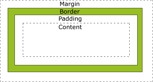
Every box consists of four areas that layer atop one other. Below, they are defined beginning from theirinnermost area are to their outermost area:
Content area: (Refer to the image below.) This is the area naturally consumed by the content that constitutes an element, e.g. the words in a sentence, an image, or the child elements contained within a parent element. In other words, the content area is the meat of an element.
Padding area: Every box can optionally have padding that surrounds the content area. This padding forces a distance between the content area and the invisible boundary of the box that dictates the element’s shape. If, for example, you had a solid background color on your element and you increased the element's padding, you’d see more color-filled space at the edges of your content area. In other words, more of the background color would spill outside the content area.
Border area: The size of the outline/border that surrounds the box. You know how buttons sometimes have thick outlines? Those outlines are the element's border area. In other words, borders take up their own space that adds onto the core content’s area; borders expand the overall dimensions of an element.
Margin area: This is the transparent white space outside the box that distances the box from its neighboring elements. Since margin determines the space between an element and its surroundings, you can think of margin as being responsible for pushing elements away from each other. For example, an element with a bottom margin of 20px will be spaced 20px away from the element below it. Negative margins can also be used, and they act just as you’d expect: they pull surrounding elements closer to the element that contains the negative margin.
Below is a visualization of each area. Imagine that this series of nested boxes is like a normal button element you'd see on a webpage:
Margin areaBorder areaPadding areaContent area
Notice how the padding area is still within the element. The background of the element will extend to include the padding area. In contrast, the border area and margin area extend past the point that the background color is defined. That’s a special behavior of the box model.
Display
In addition to the dimensions of a box, the browser must also know how to display each element in relation to its nearby elements. There are four popular display types that an element can be set to using CSS (or within the Webflow designer if you're not coding by hand).
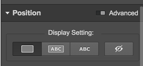
All the possible display values (block, inline-block, inline, and none) in the Webflow design tool.
Here they are:
Block: An element with a display value of block begins on a new line and takes up all the available width of that line. In other words, the content area of an element with a block display value will be 100% of its parent element.
Inline: The element appears on the same line as its surrounding elements, and only takes up as much space as its content, padding, and border areas need.
Inline-block: Same as above, but the element now has the ability to be given arbitrarily defined box area values, which is not possible with the plain inline display property. The value of this added ability is in being able to define the padding and margin for elements that you don’t want to be forced onto their own line.
None: The element is not visible and takes up no space on the page — regardless of what dimensions you set it to. This is, in effect, removing an element (visually) from a page despite its existence in the page’s code.
Let’s re-iterate these key points to ensure we fully grasp the underlying concepts:
Elements with display: block are always laid out on their own line, regardless of what their width is set to. Block elements are generally large structural/content pieces such as containers, paragraphs, lists, and headings.
This is content inside of a block-level element.
Elements with display: inline can be thought of as if they were words in a paragraph. They flow inline with other inline elements. Inline elements have their width and height automatically calculated by the browser based on their inner content; you cannot set the width or the height of an inline element. Inline elements are generally smaller pieces of content that fit inside a block element — alongside other inline elements and text. Examples include links, images, and spans of text.
Elements with display: inline-block also appear inline; however, the distinction is that you can define the width, height, margins, and padding areas of an inline-block element. In general, there is no reason to opt for inline instead of inline-block, but inline is the default behavior of many elements on the web, so most designers stick with it unless they specifically need the ability to further define box areas.
Width and height
Sizing elements for the web is not the same thing as sizing elements in a static design environment, such as Photoshop or Illustrator. Not only do the elements on a web page vary in dimensions depending on the size of the user’s browser window, but the position of one element can actually affect the position of nearby elements! Let’s explore this concept a bit further.
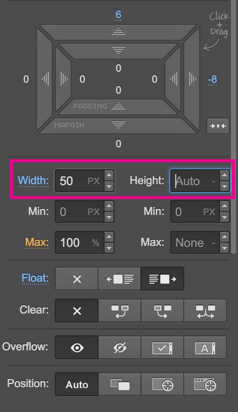
On the web, an element’s dimensions can either be sized relative to its parent element or explicitly. Here’s the difference:
A relative sizing is based on the width of the parent, e.g. an element with a width of 50% would take up 50% of the width of its parent element. If the parent width changes, the child’s width will automatically change as well!
An explicit sizing (such as a pixel value you define) is not based on the width of the parent and is completely static. It will never change — even if its parent element's dimensions change or if the browser window is resized.
It is also possible to set constraints for these two types of sizings. To do this, you specify the min and maxwidth and/or height of an element. This is most commonly combined with relative dimensions as a way of ensuring an element doesn’t get too tall or too wide. For example, you can dictate that a box takes up 50% of its parent’s size, but not if that value exceeds 500 pixels. Thus, when a size of 500 pixels is reached, do not continue to expand.
This element is set to 50% width of its parent element.This element is set to 300px width.This element is set to 50% width of its parent element.It also has a min-width of 300px. Try resizing your browser window!
If you don’t set the width or height values of an element, its values will automatically be computed based on the content inside the element (the content area). However, remember that for block-level elements, the width defaults to 100% of the parent’s box.
The box model in code
CSS is the language used for defining the box model properties of web page elements. Everything we've discussed so far is defined using CSS. The actual elements themselves are defined using HTML, but that’s a topic for a different article, which we promise we'll cover shortly :-)
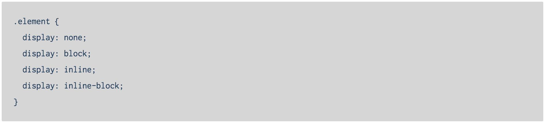
As previously mentioned, these are the four most common display properties:
(Above, we first state the class name associated with the HTML element that we’re defining CSS properties for. Then, within brackets, we enumerate the box model styling properties we're interested in alongside their respective values. If this looks like complete gibberish to you, don’t worry; the implementation details of CSS are not something Webflow requires you to know. If you are in fact looking to fully learn CSS and web coding in general, then I highly suggest taking a look at this fantastic book.)
Let’s continue with our code examples. Below are examples of how the width and height dimensions would be set for an element:

Wrapping up
Having a deeper understanding of the box model allows you to improve your design skills both in the browser and in your web mockup tool of choice (whether it’s Photoshop, Illustrator, or Webflow!) because it gives you a better understanding of how to design for how the web actually works. The closer to that reality you are, the fewer compromises will have to be made when transitioning your design work to the live production work that your customers ultimately see!
How can we help?
Have any questions about the technical aspects of the box model? Let us know in the comments below, and I’ll be sure to respond! Thanks for reading this far into this dry (but powerful) topic :)